UX/UI DESIGN
ARTCRITICAL WEBSITE REDESIGN
ROLE Analysis and concept, UI art direction and design
PROBLEM An “online magazine of art and ideas,” artcritical needed more than a visual redesign—it required a structural overhaul to be easily navigated and viewed across a range of screen sizes. The publisher/editor wanted to maintain continuity of branding and to highlight the site’s distinctive offerings: its editorial content, the proprietary search engine for current art shows and events (The List), and podcasts of the magazine’s regularly scheduled live event, The Review Panel.
SOLUTION The redesigned site, structured on a module-based system, works responsively on desktop and mobile. The coherent visual system strengthens and enlivens the brand while making navigation easy and intuitive for the user.
Design and navigation: Various module types introduce and link to complete features and articles. A content category designation is located just above each module header, and is linked to a chronologically-ordered and searchable archive of that category’s content. At the end of each article, tags with associated names and terms link to the archive.
The most important content is introduced above the fold (desktop version) on the home page. At the top, a rotating image/header block presents feature articles; immediately below are modules introducing a selection from The List, the most recent podcast from The Review Panel, and three additional feature articles.
A “Hamburger menu” opens to main and sub-categories in the desktop version and main categories only in the mobile version, for ease of navigation—the associated pages’ content is quickly viewed by swiping down.
The proposed site architecture is displayed in the chart below. Main menu items appear in burgundy blocks. A key at the top indicates module types designated by graphic frames. Full content is formatted in page template types (A - F).
TABLE SLEUTHS NYC MOBILE APP
ROLE Concept, research, UX and UI, copywriting
PROBLEM How to find a NYC restaurant where the environment will be as enjoyable as the cuisine?
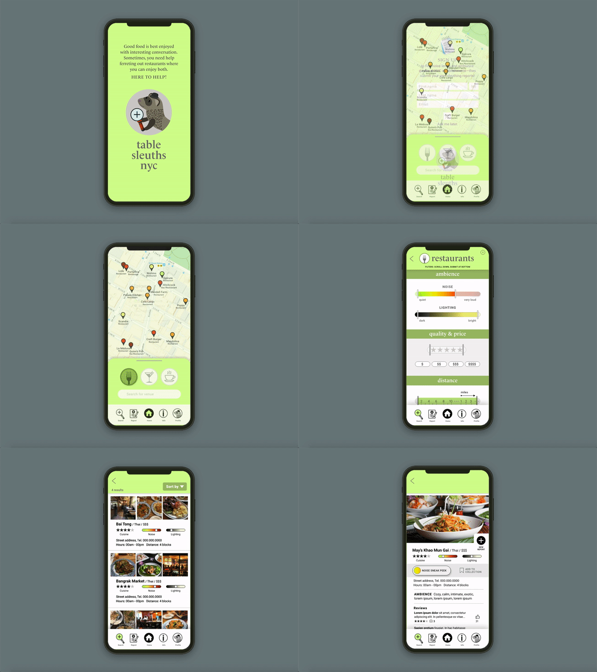
SOLUTION Table Sleuths NYC is a mobile app conceived to help users select a restaurant, bar, or coffee place through information regarding ambience—noise levels and lighting in particular—in addition to cuisine type and quality, price, and location. The app includes a map to quickly view noise level, lighting and other attributes of nearby establishments, and a set of advanced filters for a refined search for venues citywide. Users are encouraged to contribute reports from their own experience with an easy form and an in-app sound meter.
SEARCH User Flow (above)
After onboarding, the app provides an interactive map that defaults to the current location and displays markers indicating local restaurants, bars and coffee places, color-coded for noise level. The user can choose to click on an establishment for more info or go directly to the search function. Search filters include noise and lighting levels in addition to cuisine type, ratings, cost, and location. A particular venue’s profile includes a “sneak peek” of noise levels at various times during the day and week.
REPORT User Flow (above)
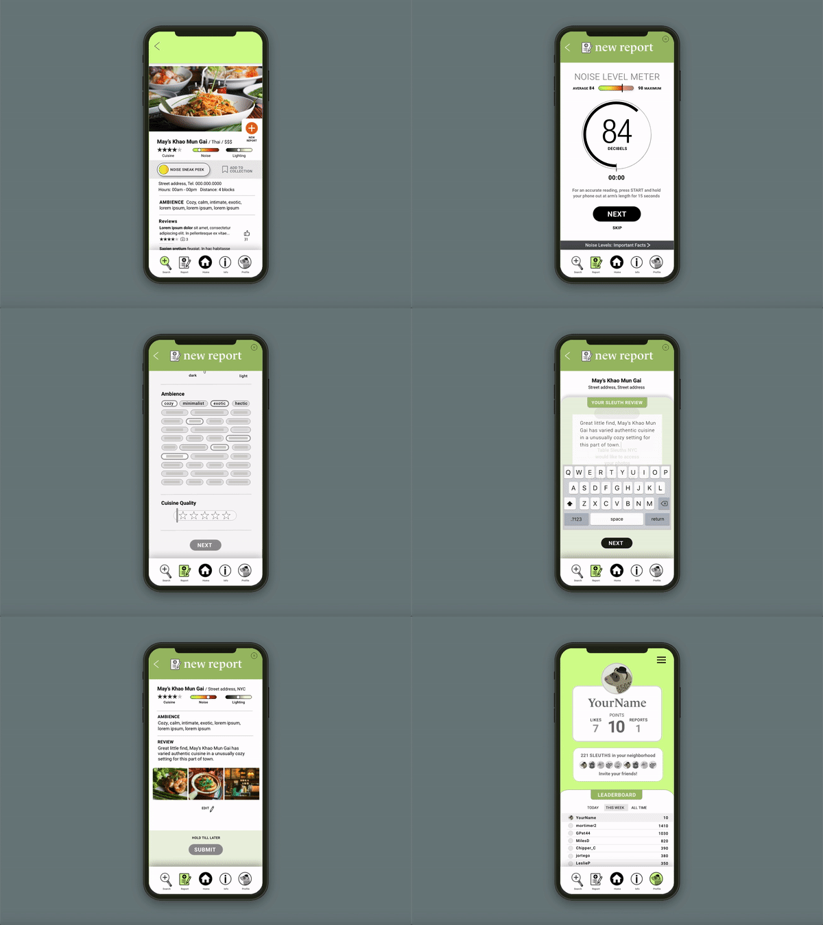
The app provides direct access to a noise meter from the bottom menu or from within a restaurant’s page. The meter records ambient noise for 15 seconds to display the current maximum level and decibel average. This reading can be instantly submitted by the user, with the option of adding to their report through selectors, comments, and photos that further describe their experience. The user gains points with each submission that, once particular levels are reached, allow avatar upgrades and access to restaurant discounts.
UX RESEARCH The interview subjects, all NYC residents, ranged in age from 24 through 64 and have occupations as diverse as hotel manager, software engineering student, and psychiatric researcher.
Interview questions were followed by a short questionnaire. A sample:
• What are your socializing habits? With friends? Family? Size of group?
• What kind of restaurant ambience do you prefer? When? Why?
• What contributes to comfort level? Why? How?
• Can you remember a time when you weren’t comfortable in the environment? What kind of discomfort did you experience?
• Questionnaire: On a scale of 1 to 10, how likely would you be to use an app that provided info about noise or crowd density? If the app included an easy-to-use noise meter, how comfortable would you be using it in an establishment?
User personas (click to enlarge)
INSIGHTS I discovered that all of my interviewees had experienced a significant level of discomfort owing to noise in restaurants. Not surprisingly, cuisine quality was most important in the selection of an eating destination, but the noise level and ability to converse comfortably had a marked effect on the the enjoyment of the experience. Lighting—too dark or too bright—was often mentioned as a quality that adversely affected comfort, as was insufficient distance from other parties owing to tightly-spaced tables.
All interviewees said that more information regarding noise and crowd density of an establishment would be helpful. Most said they would be likely to use an app that provided that info and would be favorably disposed to meter sound levels and submit reports.
INFORMATION ARCHITECTURE On the map below, the gray box contains menu items, the highlights indicate a user flow.
Information Architecture and Sample Flow (click to enlarge)


